
Do you want to learn how to improve your website’s mobile SEO and rank higher in search results in 2026?
Let me hit you with a quick stat: over 64% of all global web traffic now comes from smartphones. That’s more than half the internet. But here’s the crazy part: most websites are still built for desktop first. That mismatch is quietly costing businesses thousands of visitors every single month.
What most people don’t realize is that Google doesn’t really care about your desktop site anymore, the way it used to. With mobile-first indexing now fully rolled out, Google crawls, evaluates, and ranks the mobile version of your site. Period.
If your mobile experience is slow or frustrating, your rankings will take a hit, even if your desktop site looks perfect.
In this guide, we will cover what mobile SEO is, why it matters, how to check your mobile traffic and spot performance issues, how to tell if your site is truly mobile-friendly, and the mobile SEO best practices that actually help improve rankings, speed, and user experience.
Table of Contents
What Is Mobile SEO?
Mobile SEO is the practice of optimizing your website so it performs well on mobile devices like smartphones and tablets. It involves improving your site’s speed, design, usability, content structure, and technical setup to deliver an excellent mobile experience while also helping your pages rank higher in search results.
In simple terms, mobile SEO is about making your website easy, fast, and enjoyable to use on mobile devices while helping search engines understand and rank your content more effectively.
Why Mobile SEO Is Important in 2026
We’ve established what mobile SEO is. Now let’s talk about why it deserves to sit at the very top of your optimization priority list this year.
1. Mobile Traffic Has Taken Over: The numbers speak for themselves. Over 64% of all global web traffic now comes from mobile devices, and in several industries, retail, food, travel, and local services, that figure is even higher.
In many developing markets, including across Africa and Southeast Asia, mobile isn’t just the preferred way to browse the internet. For millions of people, it’s the only way.
What this means for your website is that the majority of people landing on your pages right now are doing so from a smartphone. If your site isn’t built to serve those users well, you’re delivering a poor experience to your largest audience segment.
2. Google’s Mobile-First Indexing Is Now the Standard: This point cannot be overstated. Google no longer treats mobile optimization as a bonus feature or a ranking preference. It’s the baseline.
With mobile-first indexing fully in place, Google uses the mobile version of your website as the primary source for indexing and ranking your content.
If your mobile site is missing pages, has thinner content than your desktop version, or loads too slowly, those weaknesses directly impact how Google ranks you across all devices, not just mobile searches.
There is no workaround for this. You either optimize for mobile or you accept lower rankings. It really is that binary.
3. User Expectations Have Never Been Higher: Mobile users are not patient. Research shows that more than half of mobile visitors will abandon a page that takes longer than three seconds to load.
Think about that for a moment; three seconds is all the time you have before a significant portion of your audience gives up and heads to a competitor.
And it’s not just speed. Today’s mobile users expect:
- Instant-loading pages that don’t keep them waiting
- Clean, readable layouts that don’t require pinching and zooming
- Easy navigation that works with one thumb
- Frictionless experiences free of aggressive pop-ups and hard-to-close overlays
- Relevant, local results that match exactly where they are and what they need right now
When your website meets these expectations, users stay longer, engage more, and convert at higher rates. When it doesn’t, they leave, and that bounce signal feeds directly back into your rankings.
4. Mobile SEO Directly Impacts Your Revenue: This isn’t just an SEO conversation. It’s a business conversation.
Mobile commerce is projected to account for over 70% of all e-commerce sales globally. People aren’t just browsing on their phones anymore. They’re researching, comparing, and completing purchases without ever touching a desktop.
So if your mobile experience creates friction at any point in that journey, you’re not just losing rankings; you’re losing sales.
Even for businesses that don’t sell directly online, the mobile experience shapes buying decisions. A local restaurant with a slow, hard-to-read mobile website loses reservations to the competitor down the street whose site loads in under three seconds. A law firm whose mobile site isn’t optimized for local search misses calls from potential clients searching “lawyer near me” on their morning commute.
Mobile SEO isn’t a marketing luxury. It’s a revenue driver.
5. Mobile dominates Local Search: If your business serves a specific geographic area, mobile SEO is important because the majority of local searches happen on mobile devices. A huge portion of those searches carries immediate purchase intent.
Searches like “open now near me” and “directions to” are almost exclusively performed on smartphones.
Google’s local search algorithm takes mobile signals seriously. Your Google Business Profile, your location-based keywords, your page speed on mobile, and your overall mobile user experience all play a role in determining whether your business shows up when a nearby customer is ready to buy.
Get mobile SEO right, and local search becomes one of your most powerful and consistent sources of new customers.
6. The Competitive Gap Is Still Wide Open: This is a compelling reason to prioritize mobile SEO in 2026, as most of your competitors are still not doing it well.
Despite all the data, algorithm updates, and industry conversation around mobile optimization, a surprisingly large number of websites still deliver mediocre mobile experiences. Slow load times, unresponsive designs, poorly structured content, and neglected Core Web Vitals scores remain widespread across almost every industry.
That gap is your opportunity. Every improvement you make to your mobile experience is a direct competitive advantage, a chance to outrank, out-engage, and out-convert businesses that are still treating mobile as an afterthought.
How to Check Mobile Traffic and Performance
Before you start improving your mobile SEO, you first need to understand how mobile users currently interact with your website.
Many website owners make the mistake of optimizing blindly without checking their actual mobile traffic, user behavior, or performance issues. But mobile SEO works best when decisions are based on real data, not assumptions.
In this section, we’ll show you three effective ways to check your website’s mobile traffic and performance.
Using Google Analytics to Check Mobile Traffic
One of the easiest ways to check mobile traffic is through Google Analytics 4 (GA4). It lets you see how many users visit your website on smartphones, tablets, and desktop devices.
To check your mobile traffic in Google Analytics, log in to your Google Analytics account. Then go to Reports > User > Tech > Tech Details.
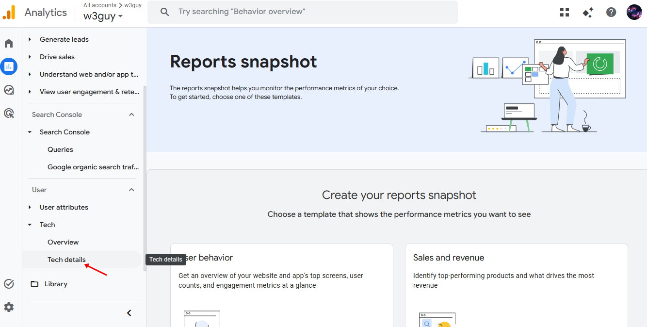
Look for the “Device Category” report.
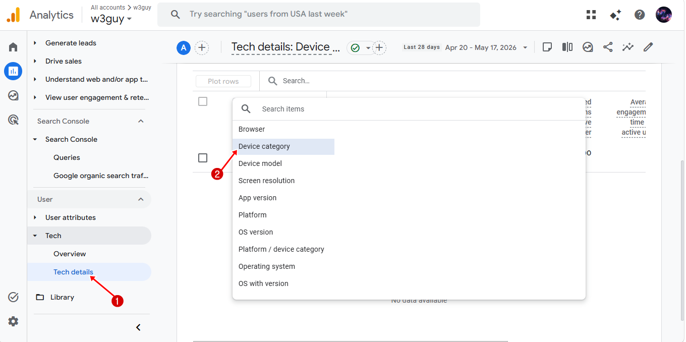
Here, you’ll see traffic broken down into:
- Mobile
- Desktop
- Tablet
This report gives you a clearer picture of how important mobile visitors are to your website. In many cases, you may discover that mobile users make up the majority of your traffic.
But don’t stop there. You should also analyze how mobile users behave compared to desktop visitors. Pay attention to metrics like:
- Bounce rate
- Engagement rate
- Average session duration
- Conversions
- Pages per session
For example, if mobile visitors leave your site much faster than desktop users, that may indicate poor mobile usability, slow loading times, unreadable content, or navigation issues.
Using Google Search Console for Mobile Performance
Another essential tool for mobile SEO is Google Search Console, which helps you monitor your site’s visibility in Google Search and identify mobile-related problems.
Inside Google Search Console, you can:
- Check mobile usability issues
- Monitor mobile search traffic
- Track mobile keyword rankings
- View indexing problems
- Analyze Core Web Vitals performance
To find mobile-related insights in Google Search Console, open your account and navigate to Performance > Search Results, then filter the results by selecting Device > Mobile to view how your website performs specifically for mobile users in Google Search.
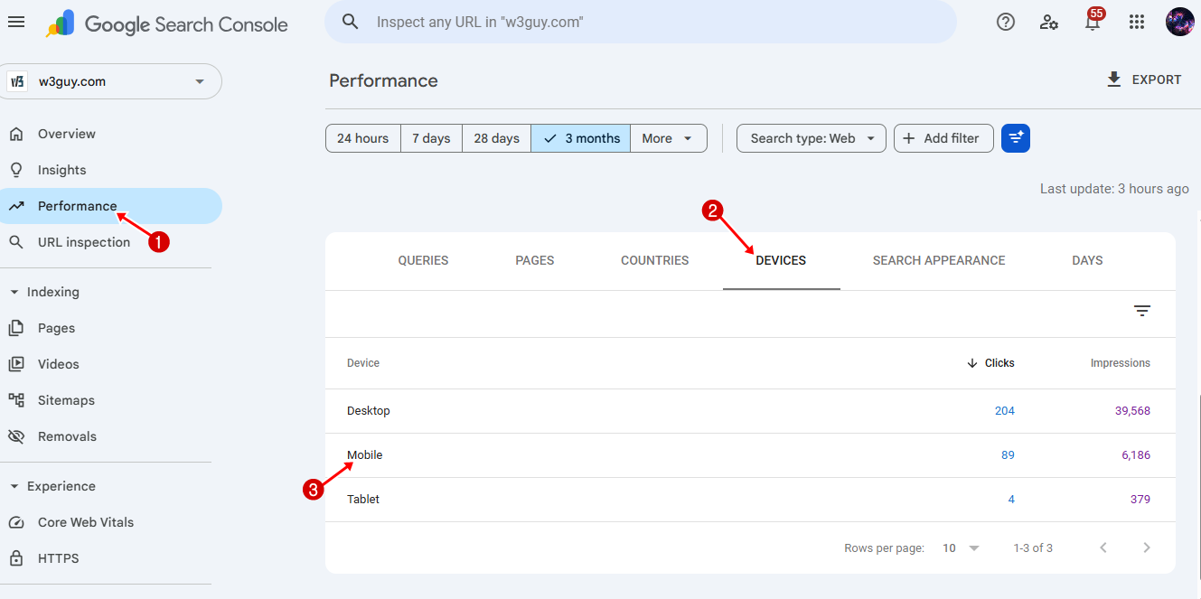
This allows you to see how your website performs specifically for mobile users in Google Search.
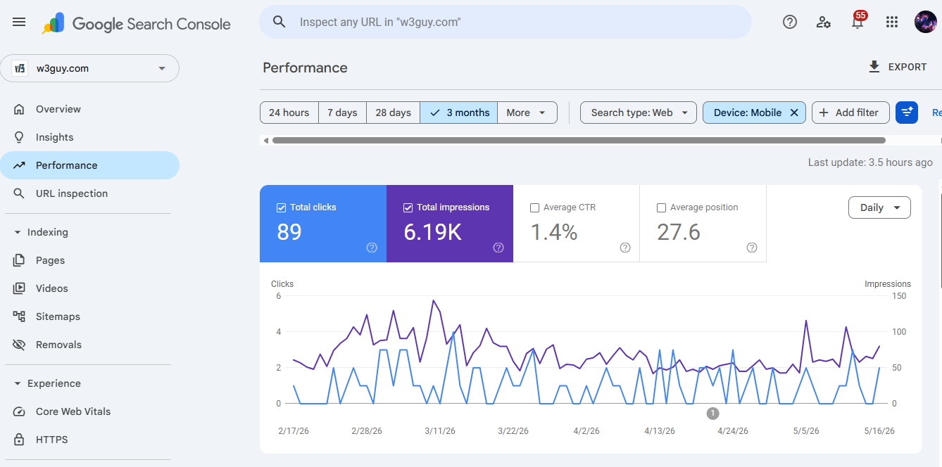
You can monitor important data such as:
- Total clicks
- Impressions
- Average click-through rate (CTR)
- Average keyword position
This information helps you identify which pages perform well on mobile and which ones need improvement.
Using CrawlWP to Check Mobile Traffic and Performance
Another effective way to monitor your website’s mobile traffic and performance is to use our CrawlWP WordPress SEO plugin.

CrawlWP not only improves search engine indexing but also provides detailed SEO statistics directly in your WordPress dashboard. This makes it easier to monitor how mobile users interact with your website without constantly switching between different analytics platforms.
A useful section inside CrawlWP’s SEO Stats dashboard is the Devices report. This feature breaks down your website traffic by device type, including:
- Mobile
- Tablet
- Desktop
For each device category, CrawlWP displays important SEO metrics such as:
- Clicks
- Impressions
- Click-through rate (CTR)
- Average search position
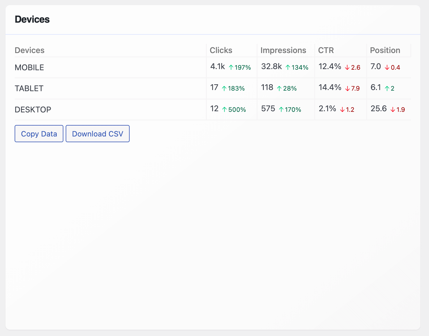
This information helps you understand how your website performs specifically for mobile users. For example, if your mobile impressions are high but clicks are low, it may indicate that your titles or meta descriptions need improvement. On the other hand, if mobile rankings are dropping, your site may have usability or page speed issues affecting performance.
CrawlWP also provides visual performance graphs that help you track changes in clicks, impressions, CTR, and rankings over time. These graphs make it easier to spot traffic trends and measure the impact of recent mobile SEO improvements, such as optimizing page speed, improving responsive design, or updating mobile content formatting.
One major advantage of using CrawlWP is that everything is available directly inside WordPress. Instead of jumping between multiple platforms, you can monitor your mobile SEO performance, rankings, indexing activity, and user engagement from a single dashboard.
How to Check If Your Site Is Mobile-Friendly
Now that you know how to monitor your mobile traffic and performance, the next step is determining whether your website is actually mobile-friendly.
A mobile-friendly website should load quickly, display properly on smaller screens, and allow users to navigate comfortably without zooming, excessive scrolling, or accidental clicks.
Below, we’ll show you two effective ways to check whether your website is mobile-friendly and identify potential usability issues that may affect your mobile SEO performance.
Using Google Lighthouse
An effective way to check whether your website is mobile-friendly is to use Google Lighthouse.
Lighthouse is a free tool developed by Google that helps you analyze your website’s overall performance, usability, and SEO. It is available directly inside Chrome DevTools, making it one of the easiest tools for testing mobile optimization.
When you run a Lighthouse audit, the tool scans your webpage and generates a detailed report showing how well your site performs across several important areas. It also provides practical recommendations you can use to improve your website’s speed, accessibility, SEO, and overall user experience.
One of the biggest advantages of Lighthouse is its heavy focus on Core Web Vitals, key performance metrics Google uses to evaluate page experience and mobile usability. This allows you to see your website from Google’s perspective and identify issues that may affect your rankings.
Lighthouse evaluates four major categories:
- Performance
- Accessibility
- SEO
- Best Practices
Each category receives a score between 1 and 100. Generally, a score between 50 and 89 is considered decent, while a score between 90 and 100 indicates excellent optimization.
To run a Lighthouse audit using Chrome DevTools, open the webpage you want to test in Google Chrome. Right-click anywhere on the page and select Inspect to open DevTools.
From there, click on the Lighthouse tab. If you cannot find it immediately, click the arrow icons to reveal additional tabs.
Next, select the categories you want Lighthouse to analyze and choose Mobile if you want to test your mobile performance. Once everything is selected, click Analyze page load.
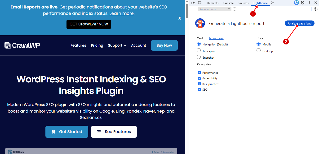
After the audit finishes, Lighthouse will display a detailed report showing your scores along with suggestions for improvement. These recommendations may include optimizing images, reducing unused JavaScript, improving mobile responsiveness, or fixing layout issues that affect user experience.
Using SEMrush
Another reliable way to check whether your website is mobile-friendly is by using SEMrush.
SEMrush is widely known as an SEO platform. Still, it also includes powerful site auditing features that can help you identify mobile usability issues, page speed problems, and technical SEO errors affecting your mobile performance.
One of the biggest advantages of using SEMrush is that it goes beyond basic mobile testing. Instead of only telling you whether your site works on mobile devices, it also helps you understand why certain pages may perform poorly and what you can do to fix them.
To get started, log in to your SEMrush account and open the Site Audit.
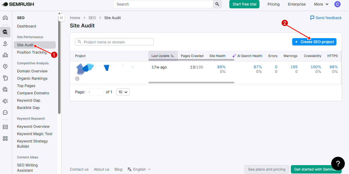
After creating a project for your website, SEMrush will crawl your pages and generate a detailed technical SEO report.
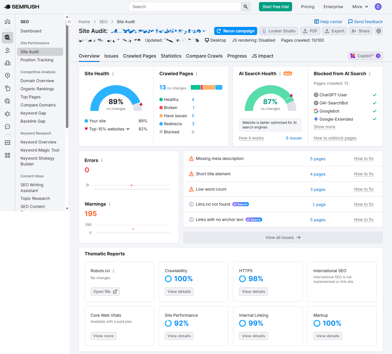
Once the audit is complete, you can review issues related to mobile usability, Core Web Vitals, page speed, crawlability, HTTPS implementation, and overall site health.
One benefit of SEMrush is its ongoing monitoring capabilities. Mobile performance can change over time due to plugin updates, added scripts, design changes, or server issues. SEMrush allows you to run regular audits so you can continuously monitor your website and catch problems early, before they affect rankings or user experience.
Mobile SEO Best Practices
Below are some important mobile SEO best practices you should follow in 2026.
1. Use Responsive Web Design
An important mobile SEO best practice is using a responsive web design. A responsive website automatically adjusts its layout, images, text, and content structure based on the device’s screen size. This means your website should look clean and function properly whether someone visits from a smartphone, tablet, laptop, or desktop computer.
Responsive design is important because mobile users expect websites to work well without needing to zoom in, scroll sideways, or struggle with broken layouts. Google also recommends responsive design because it makes crawling and indexing easier while improving the overall user experience.
One way to check whether your site uses responsive design is to view it on multiple devices. You can also manually resize your desktop browser window. If your content adjusts well without breaking the layout or hiding important elements, your site is likely responsive.
A properly responsive website should:
- Automatically fit smaller screens
- Keep text readable without zooming
- Resize images correctly
- Maintain proper spacing between buttons
- Prevent horizontal scrolling
- Keep menus easy to use on touchscreens
For WordPress users, most modern themes already include responsive layouts. However, not all responsive themes are equally optimized for mobile SEO. Some themes may technically resize content while still loading slowly or displaying cluttered layouts on mobile.
When choosing a responsive WordPress theme, look for themes that are:
- Lightweight and fast
- Mobile optimized
- Frequently updated
- Compatible with page builders
- Designed with clean code
Another important part of responsive design is setting the correct viewport meta tag. This tells browsers how to scale and display your website on smaller screens. Without it, mobile browsers may display your desktop layout improperly.
A standard viewport tag looks like this:
<meta name="viewport" content="width=device-width, initial-scale=1">Most modern WordPress themes already include this automatically, but it is still worth checking.
You should also pay close attention to your mobile menus. Large desktop navigation bars rarely work well on smartphones. Instead, use clean mobile menus, such as hamburger menus or collapsible navigation sections, to make browsing easier on smaller screens.
Images are another major part of responsive design. Oversized images can slow down mobile pages and create layout problems. Make sure your images resize properly across devices and use responsive image techniques whenever possible.
2. Improve Mobile Page Speed
Page speed remains one of the biggest factors affecting mobile SEO and user experience. Mobile users expect websites to load almost instantly, and many will leave if pages take too long to appear.
Improving mobile page speed is not about one single fix. It’s a combination of small, practical improvements that work together to make your website lighter, faster, and better on mobile devices.
One of the first things you should do is test your current speed. Tools like Google PageSpeed Insights or Lighthouse will show you how your site performs on mobile and highlight the exact issues slowing it down. This gives you a clear starting point instead of guessing what to fix.
Once you understand your current performance, the next step is optimization. One of the biggest speed killers on mobile websites is large images. Many websites upload images directly from cameras or design tools without compression, which makes pages heavy.
To fix this:
- Compress images before uploading
- Use modern formats like WebP or AVIF
- Resize images to the actual display size
- Enable lazy loading so images load only when needed
This alone can significantly improve mobile load times.
Another major factor is the use of unnecessary scripts and plugins. Every extra plugin or third-party script adds weight to your website. On mobile devices, especially on slower networks, this can seriously delay loading.
A practical approach is to:
- Remove plugins you don’t use
- Disable scripts on pages that don’t need them
- Avoid excessive tracking codes and widgets
- Limit heavy animations and sliders
Your hosting environment also plays a big role in mobile speed. Even a perfectly optimized website will feel slow on poor hosting. Shared hosting plans often struggle with high traffic or complex websites.
To improve this:
- Use reliable, fast hosting
- Consider upgrading to VPS or managed WordPress hosting
- Enable server-level caching if available
- Use a Content Delivery Network (CDN) to serve content faster globally
Another practical improvement is reducing CSS and JavaScript bloat. Many websites load unnecessary code that isn’t even used on the page.
You can optimize this by:
- Minifying CSS and JavaScript files
- Removing unused CSS
- Deferring non-critical scripts
- Loading important scripts first
This helps your page load faster and render more quickly on mobile devices.
You should also pay attention to render-blocking resources. These are files that prevent your page from loading until they are fully processed. Fixing them can improve how quickly users see your content.
Finally, always test your improvements after making changes.
3. Optimize Core Web Vitals
Core Web Vitals measure how users experience your website in real-world conditions. Google uses these signals as part of its page experience evaluation.
The three major Core Web Vitals are:
- Largest Contentful Paint (LCP)
- Interaction to Next Paint (INP)
- Cumulative Layout Shift (CLS)
Largest Contentful Paint (LCP) measures how quickly the main content of your page becomes visible. On mobile devices, slow LCP is often caused by large images, slow hosting, or heavy scripts. To improve it, you should compress images, use fast hosting, and prioritize loading above-the-fold content first.
Interaction to Next Paint (INP) measures how responsive your website is when users tap, click, or interact with elements. On mobile, poor INP usually happens when too much JavaScript runs in the background. To fix this, you should reduce unnecessary scripts, remove heavy plugins, and delay non-critical JavaScript so the page can respond quickly to user actions. A good mobile site should respond instantly when users tap buttons or open menus.
Cumulative Layout Shift (CLS) tracks how stable your page is while loading. You’ve probably experienced this before, when you try to tap something, and suddenly the layout shifts and you click the wrong button. That is poor CLS. It usually happens when images don’t have fixed sizes, ads load late, or fonts change during rendering. To improve CLS, always set image dimensions, avoid inserting content above existing elements, and use stable layouts that don’t jump during loading.
A practical way to optimize all three Core Web Vitals is to test your site regularly using tools like Google PageSpeed Insights or Google Search Console. These tools show exactly which pages are performing poorly and what is causing the issue. Instead of guessing, you get clear, actionable fixes.
4. Make Your Content Easy to Read on Mobile
Mobile users don’t read websites the same way desktop users do. On smaller screens, attention spans are shorter, distractions are higher, and reading comfort matters more than ever. If your content feels crowded, difficult to scan, or visually tiring, users will quickly leave, even if your information is valuable.
To improve readability:
- Use shorter paragraphs
- Add headings and subheadings
- Increase font size
- Use enough spacing between lines
- Break content into smaller sections
Clear formatting keeps users engaged longer and improves the overall user experience.
5. Avoid Intrusive Popups
Popups can be very effective for capturing leads, growing email lists, and promoting offers, but when they are not used properly, they can seriously harm your mobile SEO performance.
A mobile-friendly popup should enhance the user experience, not interrupt it. If a visitor lands on your page and is immediately greeted with a full-screen popup that is difficult to close, they are more likely to leave than to engage with your content.
This is why Google recommends avoiding intrusive popup that block access to the main content, especially on mobile screens.
Instead of relying on aggressive popups, you should focus on timing, relevance, and user behavior. For example, a better approach is to show popups after a user has spent some time on the page, scrolled through a section of content, or is about to exit the page. This makes the experience feel more natural and less disruptive.
This is where plugins like MailOptin become very useful for mobile SEO and conversion optimization. It is a powerful WordPress plugin that helps you build popups, opt-in forms, and email signup campaigns in a way that is both user-friendly and performance-conscious.
Instead of using random or intrusive popups, MailOptin lets you create well-timed, targeted campaigns that boost conversions without compromising user experience.
With MailOptin, you can create various opt-in forms, including lightbox popups, notification bars, slide-ins, sidebar forms, and in-post subscription forms. This flexibility allows you to choose less intrusive formats that still capture attention without blocking mobile content.
Another important feature for mobile SEO is display rules and triggers. MailOptin lets you control exactly when and where your popups appear. For example, you can show a popup:
- After a user scrolls a certain percentage of a page
- When a visitor is about to leave (exit-intent)
- After a specific time spent on the page
- Based on device type (mobile, tablet, desktop)
- Based on pages or posts being viewed
These targeting options help you avoid annoying mobile users while still capturing leads effectively.
6. Optimize for Voice Search
Voice search has become a major part of mobile SEO as more people now use smartphones, smart speakers, and virtual assistants like Google Assistant, Siri, and Alexa to search online.
Instead of typing short phrases into search engines, users now ask full conversational questions such as, “What’s the best restaurant near me?” or “How do I improve mobile SEO on WordPress?”
This shift in search behavior means websites need to optimize content differently. Voice searches tend to be longer, more natural, and more question-based than traditional typed searches. If your content is not optimized for conversational queries, you may miss a growing portion of mobile search traffic.
One of the easiest ways to optimize for voice search is by targeting long-tail keywords and question-based phrases. Instead of focusing only on short keywords like “mobile SEO,” include natural phrases people are more likely to say aloud, such as:
- How can I improve mobile SEO?
- What is the best mobile SEO plugin for WordPress?
- Why is mobile page speed important?
Adding these conversational phrases naturally throughout your content increases the chances of appearing in voice search results.
Another practical strategy is creating FAQ sections on your pages. Voice assistants often pull answers directly from concise, well-structured responses. FAQ sections help search engines understand your content better while increasing your chances of earning featured snippets and voice search visibility.
You should also focus on writing in a natural conversational tone. Voice searches sound like real conversations, so your content should feel human and easy to understand. Avoid overly robotic or keyword-stuffed writing because search engines now prioritize content that matches real user intent.
7. Optimize for Local Mobile Searches
Local mobile searches have grown significantly over the last few years and continue to play a major role in mobile SEO. People now use smartphones to search for nearby businesses, restaurants, services, and stores, as well as directions, while on the move.
Searches like “best pizza near me,” “hotel close to me,” or “pharmacy open now” happen millions of times every day.
Because these searches usually happen on mobile devices, optimizing for local mobile SEO can help drive highly targeted traffic to your website or business. The best part is that local mobile users often have high purchase intent, making them more likely to act quickly.
One of the first things you should do is optimize your Google Business Profile. This is one of the most important factors for appearing in local mobile search results and Google Maps.
Make sure your profile includes:
- Business name
- Address
- Phone number
- Website URL
- Opening hours
- Business category
- Photos and videos
Your information should always be accurate and consistent across your website and other online directories.
You should also encourage customers to leave reviews. Positive reviews improve trust and can increase your visibility in local search results. Responding to reviews regularly also signals that your business is active and engaged.
Another practical strategy is to use local keywords naturally throughout your website content. Instead of targeting only broad keywords, include location-specific phrases that users are likely to search for on mobile devices.
Also, add click-to-call buttons. Mobile users prefer quick actions, and many want to contact businesses immediately. A clickable phone number lets users call you directly with a single tap, instead of manually copying numbers.
8. Test Your Website on Real Mobile Devices
Automated testing tools are useful, but nothing replaces real-world testing. A website may technically pass performance tests while still feeling awkward or difficult to use on actual smartphones.
That is why testing your website on real mobile devices is important.
Mobile users browse your websites under very different conditions. Some use fast Wi-Fi connections, while others rely on slower mobile data networks. Screen sizes also vary widely between devices, and what looks perfect on one phone may appear broken or awkward on another.
A practical way to start is by opening your website on multiple smartphones and tablets, if possible. Test both Android and iPhone devices because browsers can behave differently across operating systems.
As you test your website, pay attention to how it feels from a user’s perspective. Try to complete common actions such as:
- Reading blog posts
- Clicking menus
- Filling out forms
- Searching for content
- Adding products to the cart
- Subscribing to newsletters
- Navigating between pages
If anything feels frustrating, confusing, or slow, your users will likely feel the same way.
Another important step is to test your website in both portrait and landscape modes to ensure layouts adjust properly when the screen orientation changes.
9. Monitor Mobile Performance Regularly
Mobile SEO is not something you set up once and forget about. Websites constantly change over time due to plugin updates, new content, design adjustments, server changes, and Google algorithm updates.
Even small modifications can affect how your website performs on mobile devices. That is why regularly monitoring your mobile performance is essential if you want to maintain good rankings and provide a good user experience.
Some of the important things you should monitor include:
- Mobile traffic trends
- Mobile bounce rate
- Page loading speed
- Core Web Vitals
- Mobile usability issues
- Mobile keyword rankings
- Click-through rates (CTR)
- Crawl and indexing errors
These metrics help you understand how users interact with your website on mobile devices and whether your optimization efforts are working.
You should also monitor your website using performance testing tools like:
- Google Search Console
- Google Analytics
- Google Lighthouse
- PageSpeed Insights
- SEMrush
- CrawlWP
These tools can identify technical issues affecting mobile speed, usability, and SEO performance.
For WordPress users, go for CrawlWP because it makes monitoring easier by providing mobile SEO statistics directly inside the WordPress dashboard. You can track clicks, impressions, rankings, devices, and keyword performance without leaving your website backend.
Start Improving Your Mobile SEO Today!
Mobile SEO is no longer optional. With most web traffic now coming from smartphones, optimizing your website for mobile users has become one of the most important parts of modern SEO.
By following the mobile SEO best practices covered in this guide, testing your website on real mobile devices, and regularly monitoring performance, you can build a faster, better, and more search-friendly website over time.
The best part is that you do not need to overhaul your entire website overnight. Start with your most important pages, fix the issues Google Search Console highlights, compress large images, and improve your Core Web Vitals step by step. Small, consistent improvements can have a huge impact on your rankings and user experience over time.
Your audience is already browsing on mobile devices. Now is the time to make sure your website is fully ready for them.